SOLVING PROBLEMS
The Client Problem
The client, the ECHL, formerly the East Coast Hockey League, wants to reintroduce a mid-level professional ice hockey team in the City of Las Vegas that will deliver a fast-paced, high-energy, and aggressive game. The design solution will overcome past challenges by creating a solid fiscal foundation while increasing revenue through promotion of brand visibility in social media, high-quality promotional items, and games that welcome local and transient fans while the organization interacts positively with the community.

Vision board

Vision Board and Brand Playbook
The first rendition of the vision board includes some of the imagery that that appears in the final version. The imagery that was eliminated was due to a conflict between the theme of the team, excitement, and the static nature of the images (Bradley, 2010). Additionally, the stylized tear behind the player started out as a film strip then became a paper torn edge. The final version is a duplicate of the edge of the black on the jerseys. As the brand assets were developed and the brand playbook was assembled, the vision board was then changed to reflect it and to keep the voice and tone the same across all the brand elements (Bradley, 2010). Visual hierarchy on the vision board and each page was thought out and size, association, color, and repetition were used while making sure everything was balanced (Messaki, 2020; Phillips, 2015).
Rejected Vision Boards

First

Second

Just, no

First
Rejected Imagery

Rejected Imagery

Rejected Imagery

Look and Feel board that was rejected, to include the color pallet and the jersey.

Rejected Imagery
onlyness statement
First version
Las Vegas Enforcers ECHL Hockey Organization is the only professional mid-level ice hockey team in Las Vegas, Nevada that provides a rush of excitement and affiliation with like-minded, educated, working millennials and their families to others who also have a passion for the fast-paced energy and aggressive game play of ice hockey. Keeping the organizations commitment to the community through sponsorship and meaningfully connecting with fans and attendees at the forefront, the ECHL will make it happen through the creation and implementation of a fun, organized, comfortable, and affordable, climate-controlled hockey viewing experience and a team comprised of energetic, professional level players.
The onlyness statement was revised to use language that denotes excitement and the rush one gets from watching contact sports. This change was due to feedback that stated there were too many features cited that were boring and unappealing and the wording was the opposite of exciting.

typography
Typography – Of all the brand components, a lot of time was spent on choosing the fonts for the brand. One of the primary decisions was to go with a sanserif typeface because it would convey a more relaxed feel (Kramer, 2021). It is also clean and reflects the sharp edges associated with hockey and ice (Saltz, 2014). Initially, the font family Expo was chosen for the subheading and body text and a decorative font called Angels for the Headings. The reason behind the choice is that Expo is clean and has an x-height that is equal to the ascenders. This echo’s the idea of a stick (Saltz, 2014). Additionally, the two fonts chosen were italics, as the forward slant implies movement and echoes the slant in the font Angels (Saltz, 2014). The idea behind the font choices stayed even as the fonts themselves were switched out due to the need for more flexibility. Clemente replaced Expo but was then eliminated due to a lack of condensed, extended, black, and extra-bold fonts. Briefly, Walkway was considered but also went in favor of Mezmerize Which contains ideal variations.
The font Angels was replaced during the logo development phase. Tiza, a slab-serif distressed decorative font was chosen last.There was a need for a gritty font to be used to promote special events and offers. Slab-serif fonts are often associated with sports teams, adding the distressed aspect gives it contrast to the clean lines of Mesmerize and draws the eye of the viewer.

Logo – Typography played a large part in the logo design. During the brainstorming process many logos were done as thumbnails In order to explore every idea, no matter how ridiculous (Blades, 2021). Some inspiration came from other sports teams as well, especially the Seattle Kraken, whose logo is a creatively used S with a tentacle in the negative space (Logobee, 2021). The thought behind the choices was about making a logo that would be remembered and that reflected the city in which the team plays (Logobee, 2021). Once the brainstorming was complete, logos choices were whittled down to six choices, a star, a compass rose, a gangster, a fox, a skate, and a Jack of spades playing card. Each had aspects that were good, but most were too complicated. The final choice was a combination of star and compass rose that was simplified and reflected the star on the Welcome to Fabulous Las Vegas Nevada sign. This logo then went through several stages. The font Bungee was used at first with a star radiating out from the O in Enforcers. The curves on the letter shapes did not work, so Quicksilver Oblique replaced it. The colors chosen at this point were red, and a combination of neon green and purple to reflect excitement and a sense of royalty or money. Where the red was aggressive, it did not read well, and the purple and green, did not convey the voice of the team.

The final color choices, orange-red and light and dark blue, reflect a professional, yet aggressively exciting voice (Gremillion, 2019). As the slant of Quicksilver is dramatic it allowed for the elimination of the slanted shapes at the beginning and end of the wordmark. Once those choices were made, the location of the star moved to the beginning of the word, and the eight-point start was replaced with the twelve-point. The E in Enforcers was then put into the negative space and the Right horizontal star arm then extended, bisecting the word like a lance, giving it a subtle association with the Las Vegas Golden knights. The star explodes out from the E giving it an even more aggressive feel. The fact that Stars are associated with achievement, excellence and power is an added bonus (Zaballa, 2022). Thought was given to making that shape identifiable so it can stand alone once the brand becomes more recognizable. The final revision was with the script font used for the city name. the initial choice was not very legible and was too formal for the voice and tone of the brand.
Brand Assets
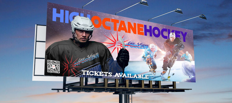
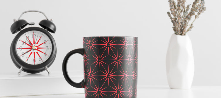
Brand Assets - The brand assets were developed to solve a problem that the ECHL had encountered in the first try with the Las Vegas Wranglers (Full Sail University, 2021). A lack of revenue meant that the team could not sustain itself (Full Sail University, 2021). Each of the assets are designed to increase revenue by growing the fan base. This will be done by increasing brand exposure inside and outside of the Las Vegas area through advertising and social media and giving consumers high quality and affordable team merchandise (West, 2018). Additionally, the idea behind much of the advertising is to promote the excitement of the game and the team, rather than the individual players. Mock-ups were developed for the social media sites and web pages as well as merchandise.
The letterhead and motion graphic were revised but the other assets did not need it, except for adding a small full logo onto the assets that only used the star, such as the t-shirts. The issue with the motion graphic was in the video clip. The first selection of the hockey stop was copyrighted and there was no way to purchase it. Another clip was found that was in the public domain which worked. The other revision was in the granular nature of the fade effect applied to the logo. The size of the grains was increased to match the snow from the stop. The stationery needed to match the voice of the brand, so changes were made to the dark blue background.
References
Blades, G. (2021). How thumbnails guide our design process. Retrieved from Blades Creative Design Studio: https://www.bladescreative.com/blog/how-thumbnails-guide-our-design-process
Bradley, S. (2010). Unity In design: Creating harmony between design elements. Retrieved from vanseo design: https://vanseodesign.com/web-design/design-unity/
Full Sail University. (2021). Las Vegas Enforcers: Brand profile. Retrieved from MDM615: 1.7 Mastery Journal: https://fso-lms4-immortal-assets.s3.us-east-1.amazonaws.com/318/20215/5446cba2-9e26-482c-8771-f8b1689078e8-a8180e4d-b2ca-4d20-b1ba-b1c7972e43a2/Brand_Profile-Las_Vegas_Enforcers.pdf?X-Amz-Algorithm=AWS4-HMAC-SHA256&X-Amz-Content-Sha256=UNSIGNED-PAYLOAD&X-
Gremillion, A. S. (2019). Colors and emotions: How colors make you feel. Retrieved from 99 Designs: https://99designs.com/blog/tips/how-color-impacts-emotions-and-behaviors/
Kramer, L. (2021). Typeface vs. font: What's the difference? Does it matter? Retrieved 2022, from https://99designs.com/blog/tips/typeface-vs-font/
Logobee. (2021). Sport team logo design in 2021. Retrieved from Logobee: https://www.logobee.com/logo-design-blog/post/sport-team-logo-design-in-2021
Messaki, E. (2020). Balance in composition: How to balance design? Retrieved from Medium: https://medium.com/outcrowd/balance-in-composition-how-to-balance-design-185afda003d7
Phillips, M. (2015). Design principles: An introduction to visual hierarchy. Retrieved from Toptal: https://www.toptal.com/designers/visual/design-principles-hierarchy
Saltz, I. (2014). Typography: Choosing and combining typefaces. Retrieved from Linked In Learning: https://www.linkedin.com/learning/typography-choosing-and-combining-typefaces/welcome?u=50813145
West, D. (2018). Hockey’s changing culture. Retrieved from GTHL Canada: https://gthlcanada.com/article/hockeys-changing-culture
Zaballa, R. (2022). COPY these 10 star logo designs. Retrieved from Penji: https://penji.co/star-logo/
Zamore, J. (2020). Brand voice for your athletic program. Retrieved from Gipper: https://www.gipper.com/blog-3/post/brand-voice-for-your-athletic-programfirst-namelast-nameemailphone


